
TripAdvisor – Tourism
TripAdvisor aims to help travelers plan and book their perfect trips by engaging travelers throughout the travel lifecycle: Planning the trip, during the trip and re-engaging travelers when they return from their trips. This project aimed to facilitate the exploration of destinations by centralizing all the information they would need on this Tourism page. With over 100 million monthly unique users, we were able to deploy numerous iterations in order to get the best product possible. I worked alongside Sr. Product Designer Brian Beavers to arrive at the solution presented below.
Want to see it in action? Please download the TripAdvisor® iPhone® and Android® applications.
AdvisorsBrian Beavers, Phillip MertensFieldsInteraction Design, UX/UI Design, User Research, PrototypingYear2016
01
Challenge
TripAdvisor’s current search function allows you to view an “Overview” of a location but this page only displays quick links to a bank of information which could be frustrating to the user. Our challenge was to redesign the Overview experience in order to create a frictionless user flow and have the user easily find what they were looking for.
02
Discovery
We wanted to ensure the user had the best experience possible. In order to arrive at a testable solution, we scheduled 10 users to test our current experience.
Our main hypothesis was that users wanted curated content
03
Definition
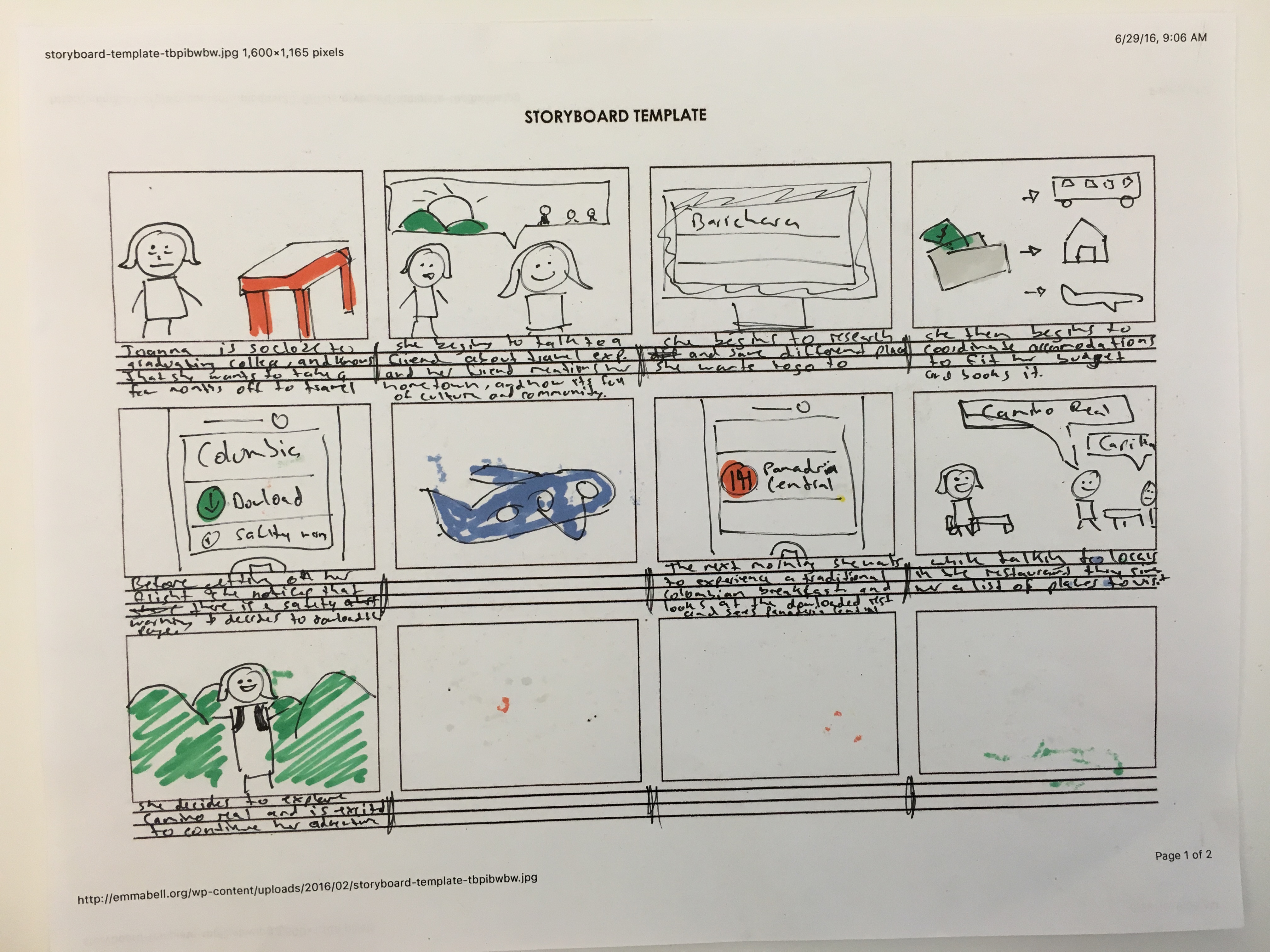
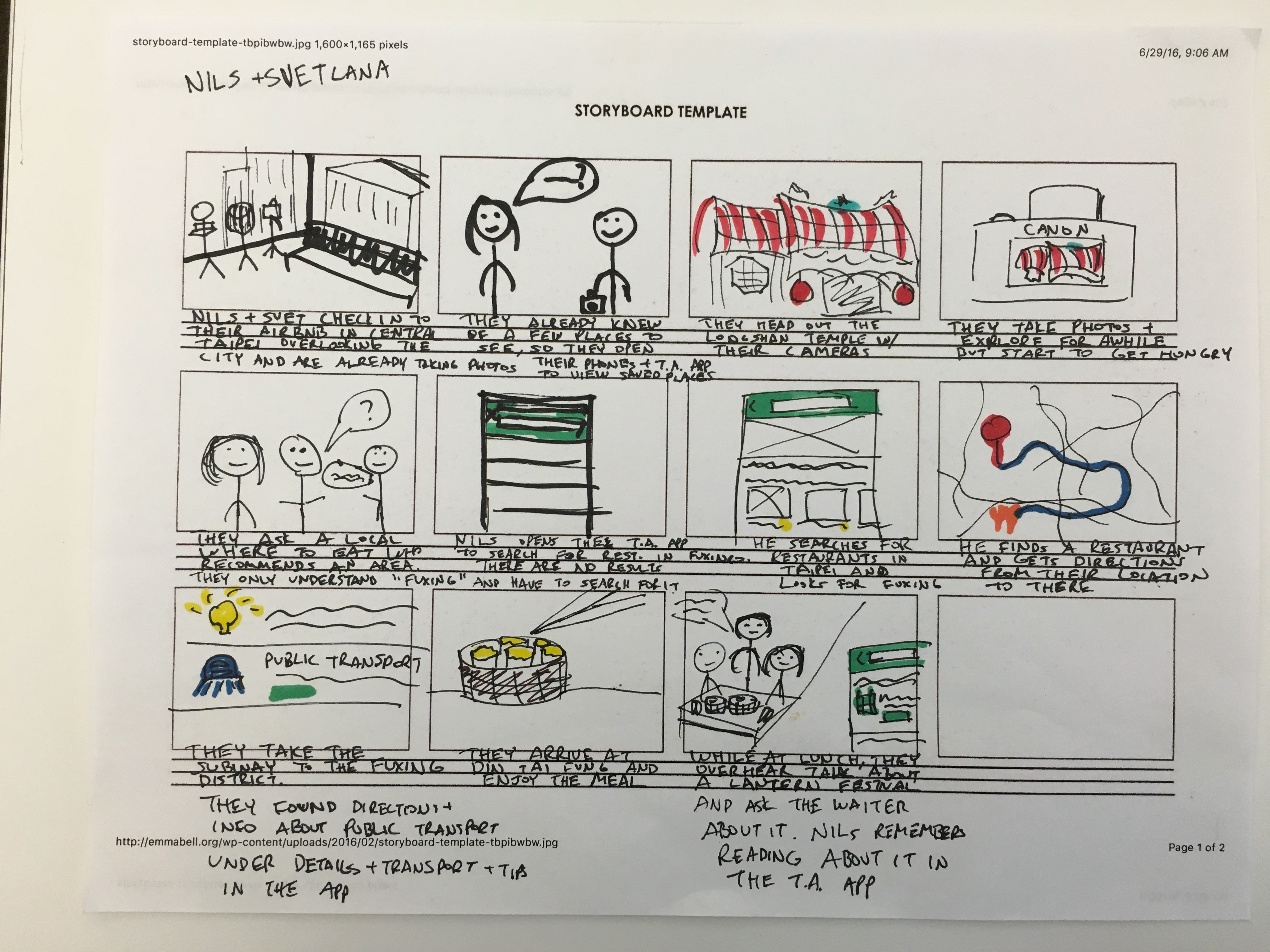
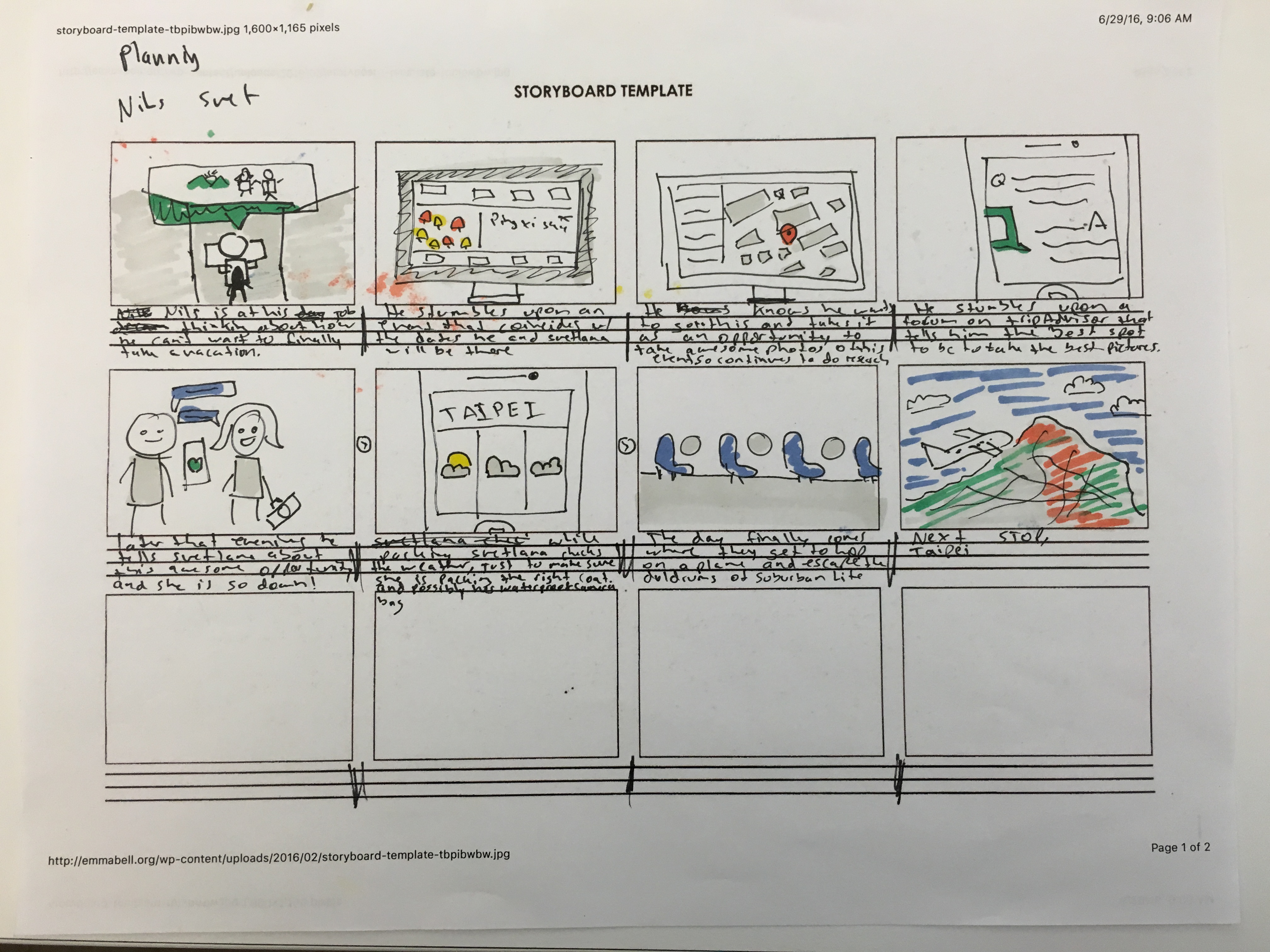
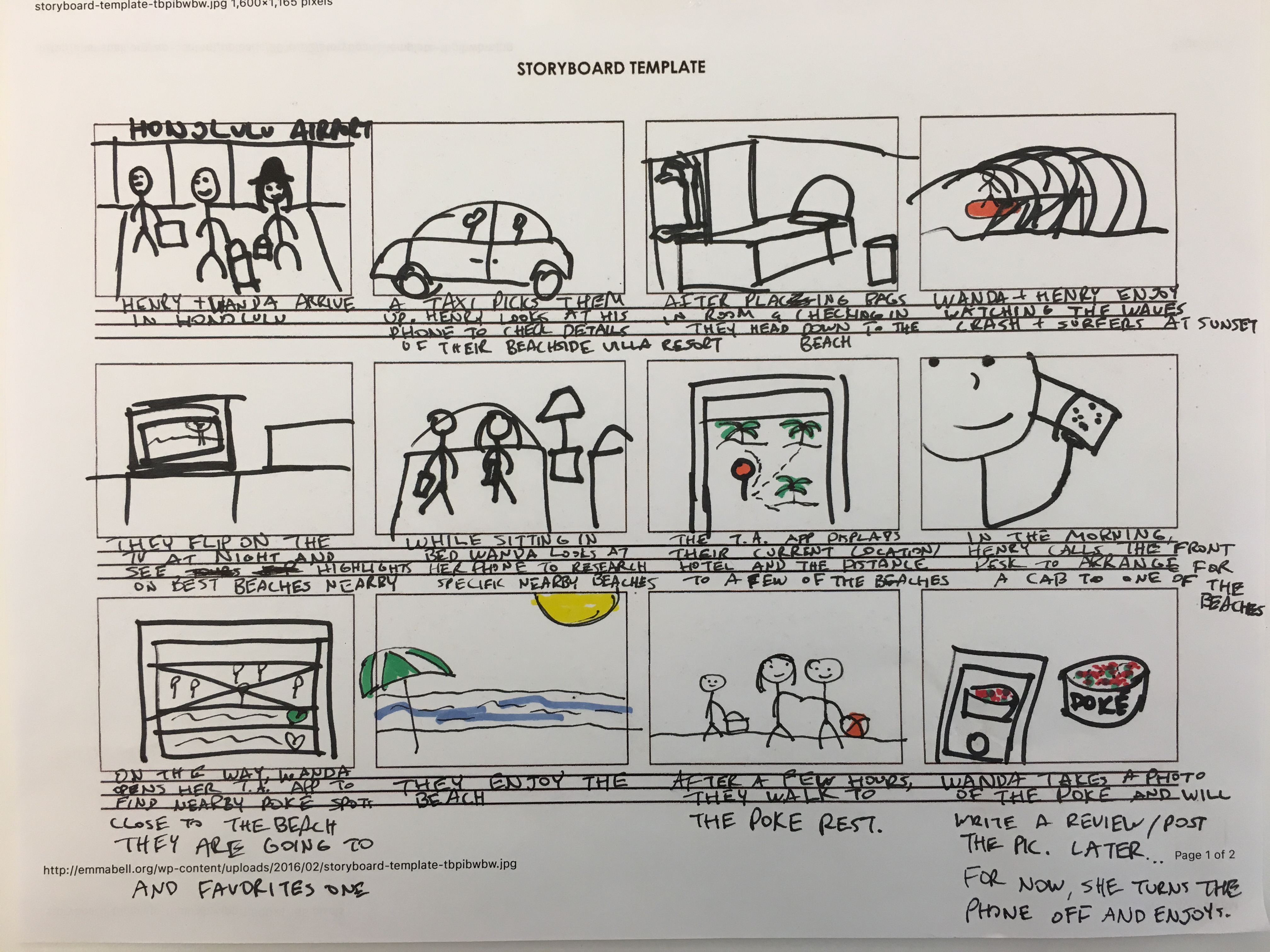
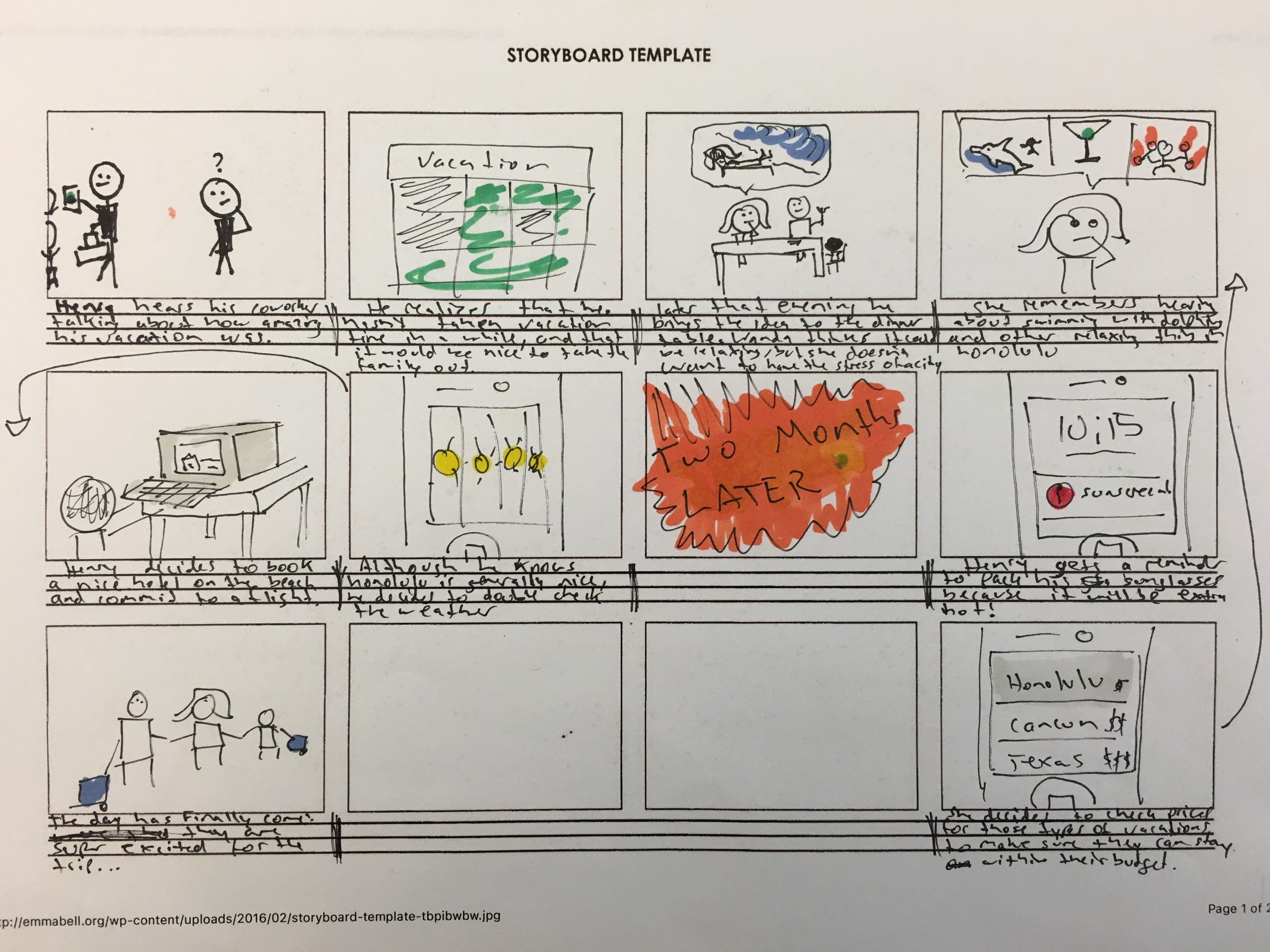
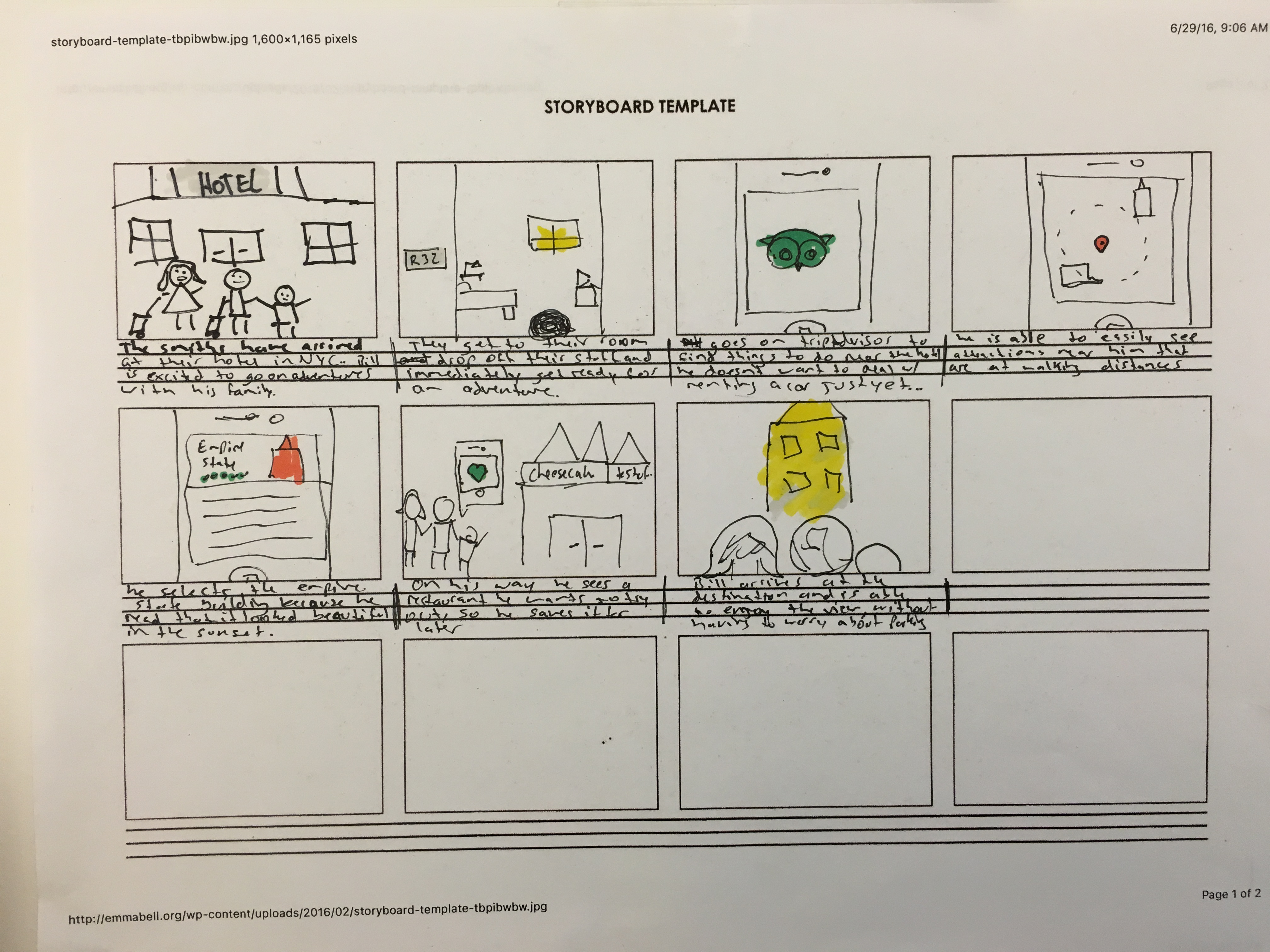
We created persons to better under understand our users in order to design the best experience possible.
- 1. Family
- • Needs relaxing and family-friendly activities
- • Activities should (preferably) be at walking distance
- • On a budget
- 2. Couple
- • Prefer to have a local experience
- • Seeking thrilling adventures outdoors
- • Want to try all the best food in their location
- 3. Single Traveler
- • Seeking exposure to different cultures and community
- • On a budget
- • Wants to go off the beaten path and explore on their own
04
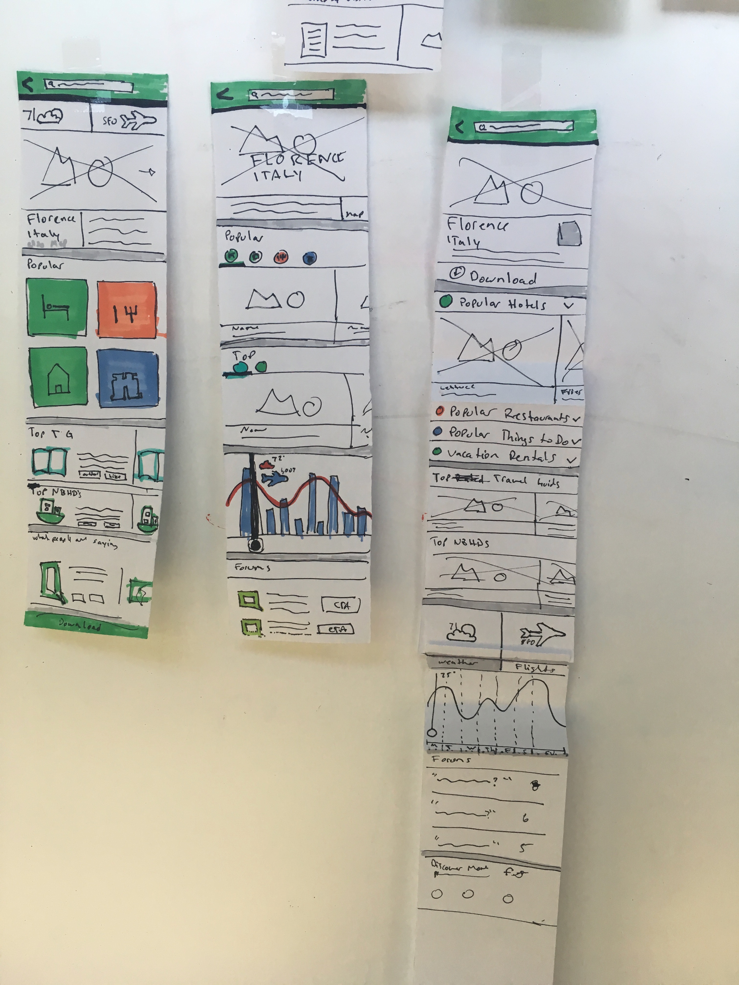
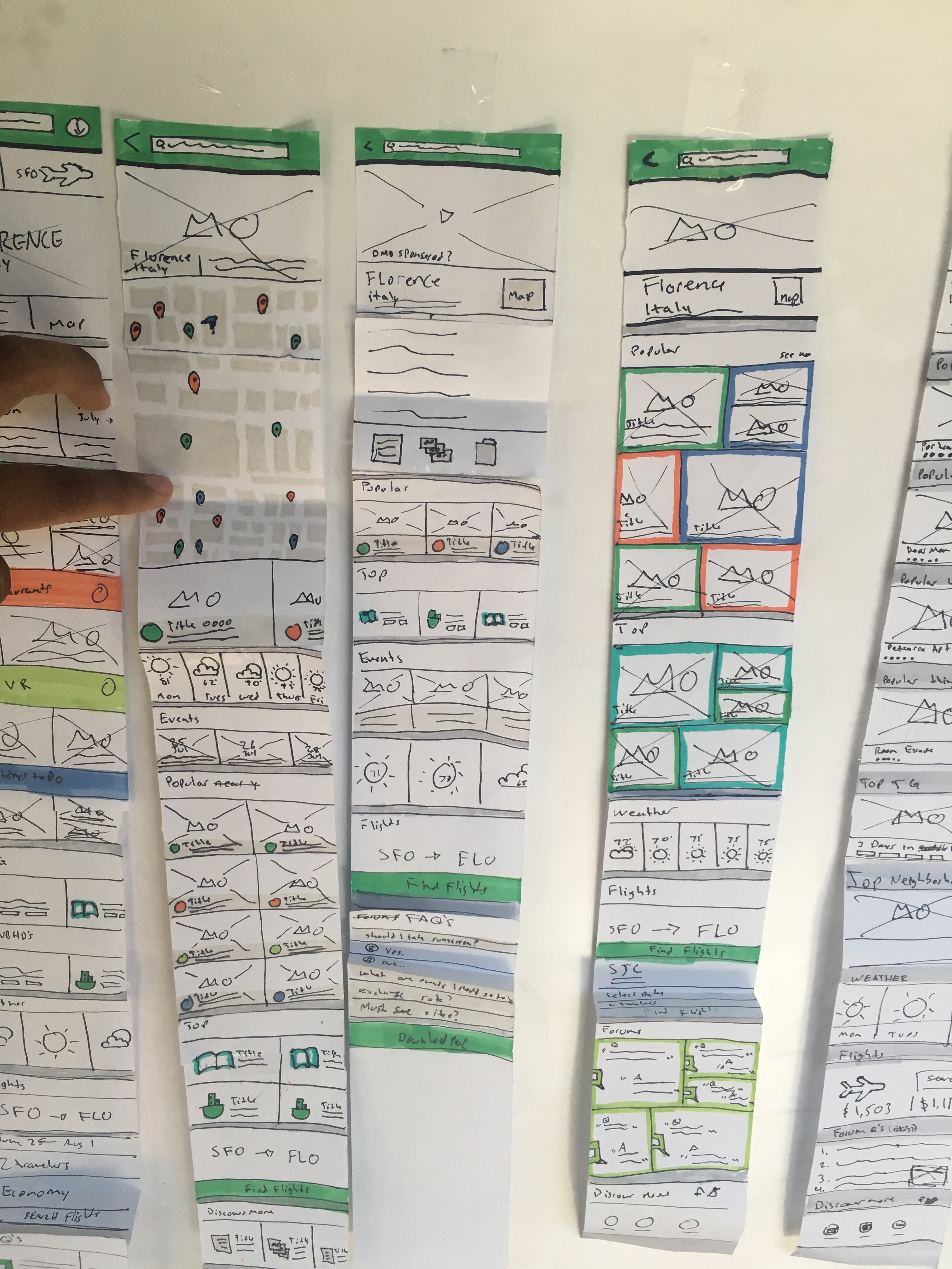
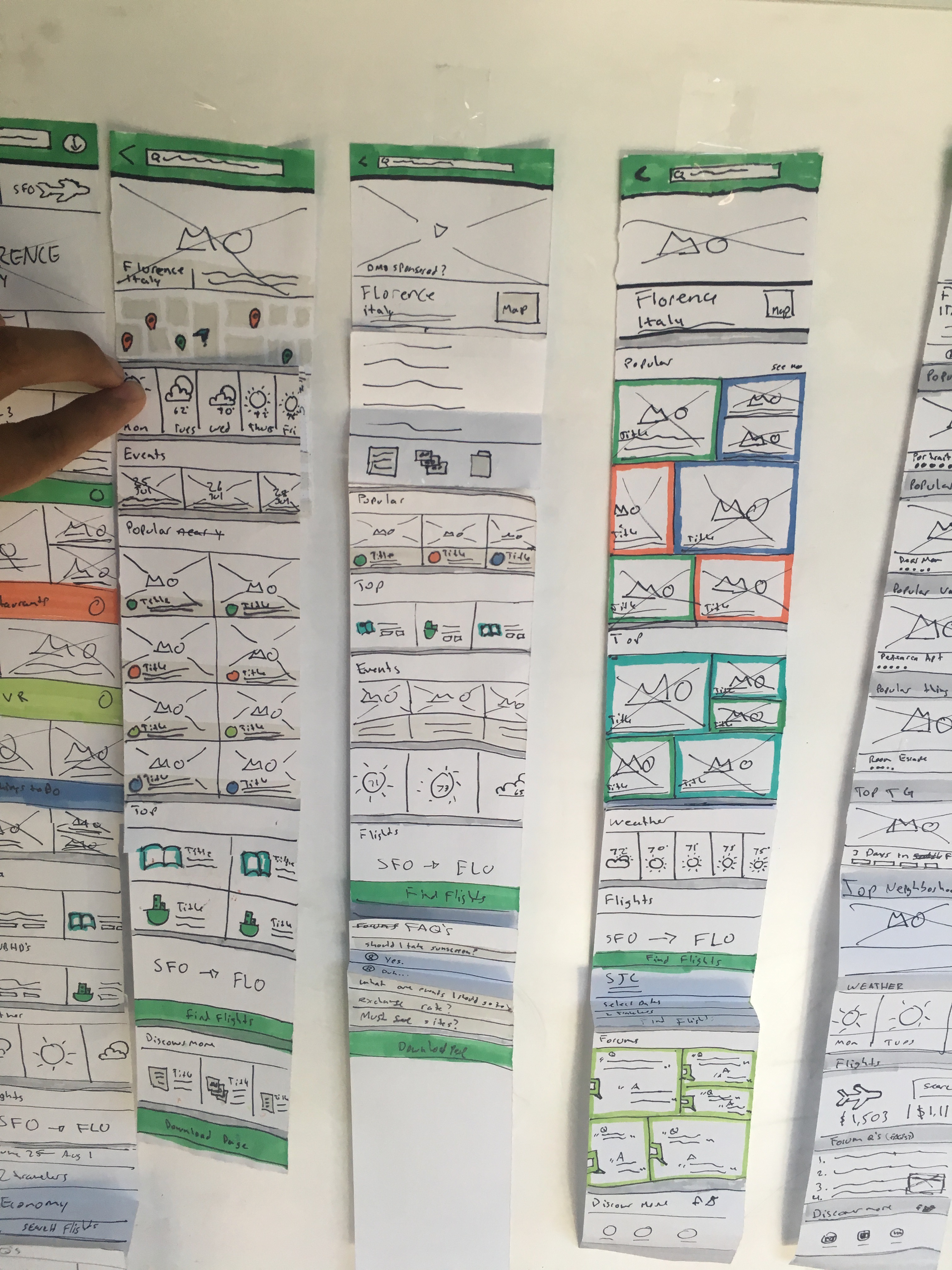
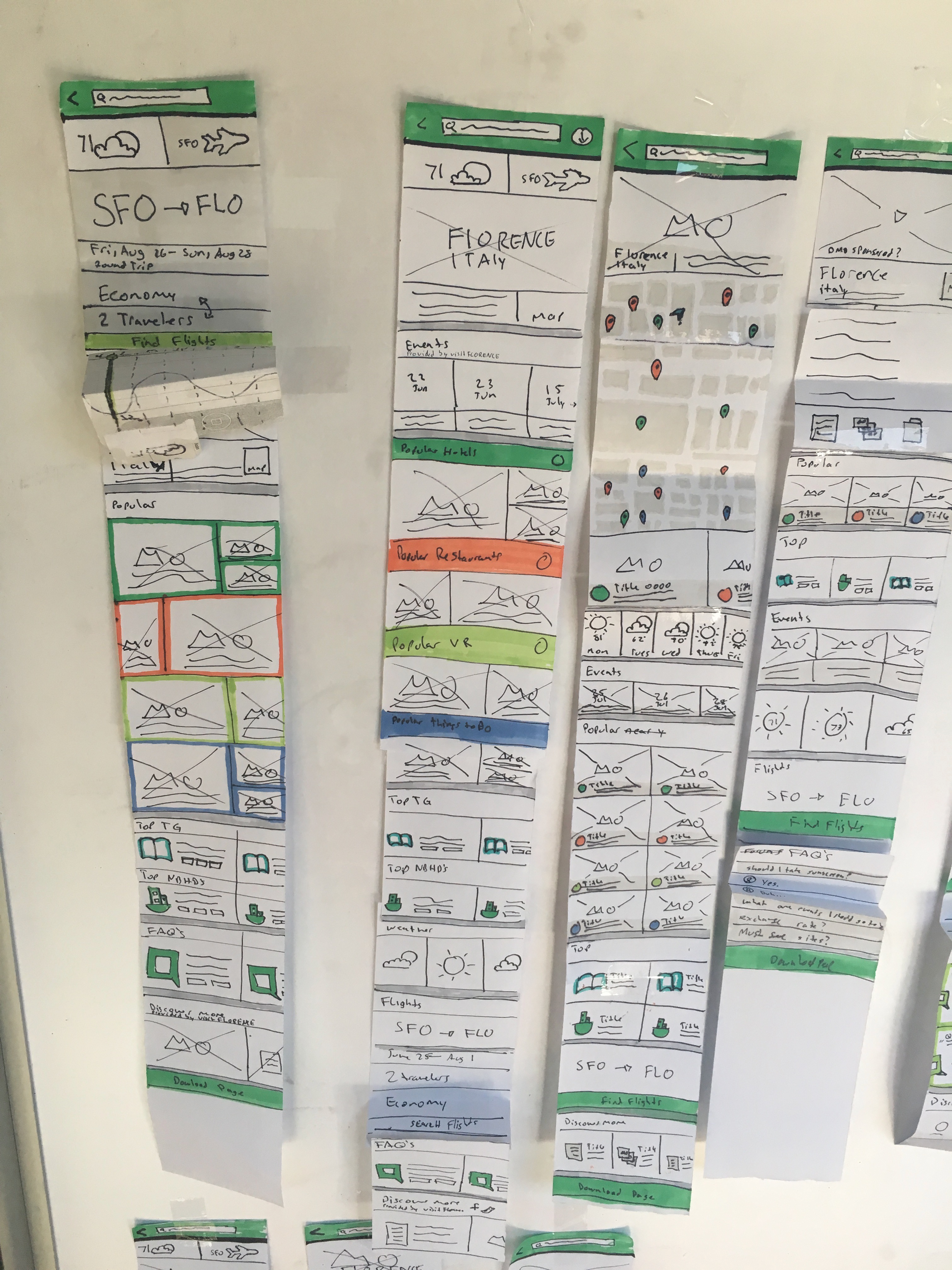
Ideation
Now that I had a good understanding of my users, I began to explore potential user flows. By designing low fidelity paper-prototypes, I am able to validate directions quickly that then help me move to a digital prototype.
05
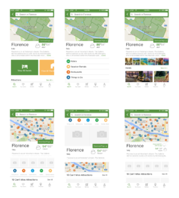
Prototyping and User Testing
We narrowed down what we wanted from the sketches and decided to translate them into digital form in order to get feedback from users.
Below you can see a few of the explorations we did.
Findings
- Users loved the curated content
- The map experience was extremely useful to the user both in the planning phase as well as in-destination
- Providing suggestions for similar destinations kept the users in the app and helped them ultimately decide on a location
- The language for “Download Page” was very important because users now knew that they could take this info offline with them.
06
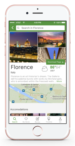
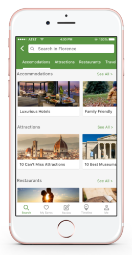
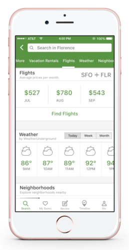
Final Visuals and UI
After testing the digital prototypes with 10 users, we decided to refine our final solution. The most important aspect of this design was being able to show the user curated content. They already knew they wanted to be in that location, they needed help deciding what to do, where to eat, and where to stay. We used carousels to prominently display content followed by relevant information on cards.